Design, Trust & Manipulation – How Businesses Abuse the Power of UX
If you’re anything like me, good website design immediately instills a sense of trust in you and bad design raises red flags. If I go to a website and see big blocks of small text in weird fonts, ad clutter and an overall unappealing layout, I immediately get a feeling that something isn’t right, even before I take a look at the content. Something about bad design causes an immediate visceral recoil and can make or break the success of a company’s online presence.
Why?
If a company is truly concerned about creating a successful business and products/services of quality, it’s natural to expect that they would invest the necessary resources to create an appealing user experience as well. After all, the quality and level of care given to the product or service should extend to its presentation. You wouldn’t expect a diamond ring to be wrapped in a greasy paper bag, would you?
Let’s look at an example. Recently, I was trying to make a payment online and a page popped up to ask me for my social security number so that it could confirm my credit card info. The design of the page was so unappealing and clunky that I immediately thought it was a scam. Before I put in any info I Googled “is this page legit?” What I found were multiple users of the site asking that same question and responses to them along the lines of “Yes, it’s legit, it just looks really sketchy.” So it appears that good design is, for many people including myself, synonymous with security, professionalism and trustworthiness, even if that’s not the case.
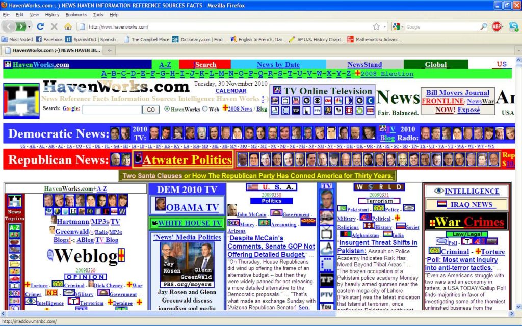
In this example we can see that the actual content appears to be good, but the design is an immediate turn off
Does good design always = good content?
With so much information to process in the modern world, there is no time to sit and make in-depth analyses about the true legitimacy of each piece of content. Our brains sort the information we receive into categories called heuristics to speed up processing. In this case, the heuristic would be “good design = good content” because this rule is more often true than not. However, much like stereotypes, such a heuristic isn’t always correct. And this discrepancy between the assumption and the reality is what some businesses take advantage of in order to manipulate customer behavior.
Dark Patterns in UX
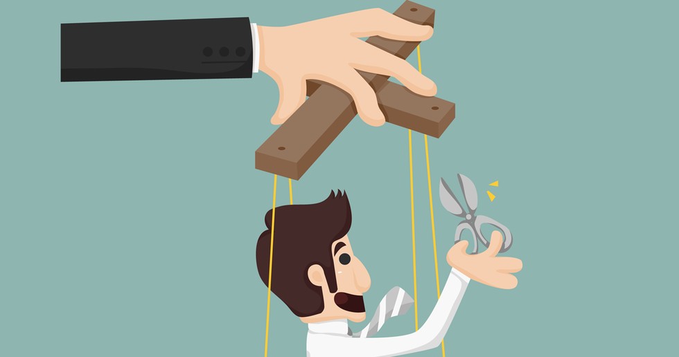
We are intuitively aware that the driving principles of good web design are simplicity, clarity and a positive user experience, therefore we often let our defenses fall when interacting with a well-designed interface. That makes us vulnerable to manipulative design tactics that lead us towards actions we didn’t intend to take. Tricky and deceitful tactics in UX (User Experience design) are called Dark Patterns. They involve using design tricks to lead you towards the action that the company wants you to take, not necessarily the one you want to. For example – making an unsubscribe option very difficult to find, making their desired button the largest and most notable one on the screen or pre-highlighting it, playing with font sizes and colors to make certain information hard to find/read, manipulating the user’s flow of clicks towards the company’s desired outcome, using tricky wording and page layout, etc.
The website darkpatterns.org has been set up to let users shame the companies which use them.
A few examples:
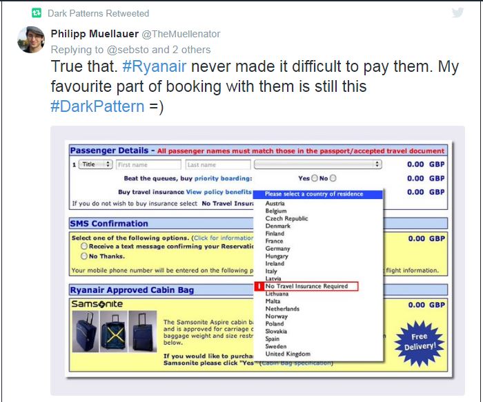
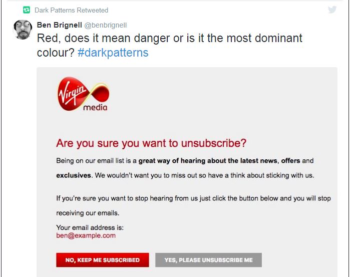
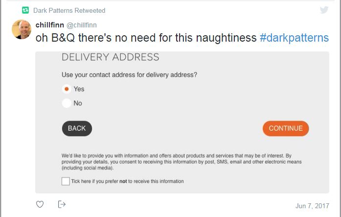
Looking at these examples, some might argue that Dark Patterns are unsavory, sure, but they’re not exactly unethical. After all, the information the user needs might be less noticeable than we would like it to be, thereby easily missed, but it is there. Therefore, one can argue (and businesses faced with such criticism surely do), that the fine print said everything that legally needed to be said and if the user didn’t pay close enough attention, well that’s their problem.
But this is where the manipulation and abuse of power comes into play. Lapses in attention are fundamentally human. And using weaknesses in human nature to trick people into certain profitable behaviors is less than commendable. But it is tempting, and even big business like LinkedIn and Amazon have given in to the lure of sneaky tricks and the instant surge of customers they can lead to.

Now You See Me (2013)
UX Magic
Magicians also use gentle nudges and lapses in attention to make us believe something that isn’t real. Except magic is meant to entertain, not to separate you from your hard-earned money (unless we’re talking about that Now You See Me movie). And people consent to being “magician-ed” whereas they expect clarity and honesty when they engage in business transactions. Another thing magicians do is lie, but this is something most viewers (over the age of 11) are aware of and consent to as it makes the magic more fun. Businesses also lie, however they do it without the user’s knowledge or consent.
One seasoned UX designer gives a behind-the-scenes glimpse when he recalls “I’ve seen many examples of fake social proof, e.g. items marked as popular [not because they actually are popular, but] because there’s a stockpile of those unpopular items and they need to be sold.” Does the motivation to sell in a dog-eat-dog economy make it ok to deceive customers? When does a bit of glamorizing exaggeration become a full on lie? And where do we draw the line between acceptable business persuasion and unethical manipulation?
The line between persuasion and manipulation can be difficult to draw
Moz.com writer and Marketing Scientist Dr. Peter Myers gives examples of each of the 5 primary sales scenarios and contemplates whether they fall into the category of persuasion or manipulation.
Scenario 1: Simple Alignment – the Customer wants X, your Client (employer, etc.) sells X, and you work to facilitate the process. Persuasion
Scenario 2: Simple Choice – the Customer wants either X or Y, but hasn’t made up their mind. So, you nudge them to make a choice that fits your objectives. Persuasion
Scenario 3: Competitive Choice – the Customer wants X, but your Client has a Competitor also selling X, so you steer the Customer toward buying from your Client. Persuasion OR Manipulation (depending on whether you lie about your own product or that of your competitor)
Scenario 4: Unknown Desire – Sometimes, Customers have no idea what they want. In that case, the job is to persuade customers to want things they didn’t even know existed but that your Client is selling. Persuasion OR Manipulation (depending on whether you create a genuine desire that is actually fulfilled by what you are offering)
Scenario 5: Altered Decision – Sometimes salespeople sell someone something they didn’t originally want at all. The Customer is looking for X and you convince them to buy Y. Persuasion OR Manipulation (depending on whether your pitch involves pressure and/or deceit)
In the end you have to look at the techniques used in the marketing process and the intent behind the UX tactics. Lying, misrepresenting the benefits of a product and/or pressuring a customer to make a decision by pressing emotional buttons is manipulative. Using sleek and appealing design to make information about your product easily found and understood, clearly displaying honest claims about its benefits and making the purchase process as easy as possible is persuasive. And in the end, it’s more effective.
This is because misrepresenting a product or tricking a user into doing something they didn’t intend to do may initially get a company a surge of new clients but karma is a *itch. In this Internet age where information is widespread and big business deceit goes viral, people are developing higher and higher expectations for business practices. So when Dark Patterns emerge into the light, the result is often a big hit to the businesses’ reputation and success.
Final Words of Advice
With all this in mind to businesses I say: there is much more benefit in transparency, clarity, and creating a pleasant user experience, the true guiding principles of UX, than of manipulating design principles to trick your client base. Clients are smart and getting smarter, and they don’t easily forgive when someone plays with their minds, hearts and pocketbooks.
And to customers I say: be aware that despite how user-friendly the design of a website may seem, in the end, businesses are usually motivated by profit. User-friendly is only so because happy customers are generous customers. So, as is true in love and war, pay close attention to who and what you trust. You are the one who makes the final decisions and the one who pays the price for them.
And if you catch someone using tricky UX design to force your hand, head on over to darkpatterns.org and alert the online community. Monitoring and feedback like this can help create a standard for ethical marketing and quality service that will benefit both customers and businesses in the long run.




Recent Comments